
The Athletic - login methods
Redesign of the The Athletic’s login and registration flow process for the Growth team. The project involved redesigning UI components, improving UX flows and interactivity, adding social login options, updating error messaging logic for web, iOS, and Android apps.
Problem
it all started when…
The login/registration experience hadn’t been redesigned since its origin four years ago. It was time for a brand and functional update. This involved updating the sign-up process visual UI and interaction flow for Login, Registration, Reset Password, Forgot Password screens, and variations of these screens.
The Athletic original registration web page from 2016-2020.
login methods
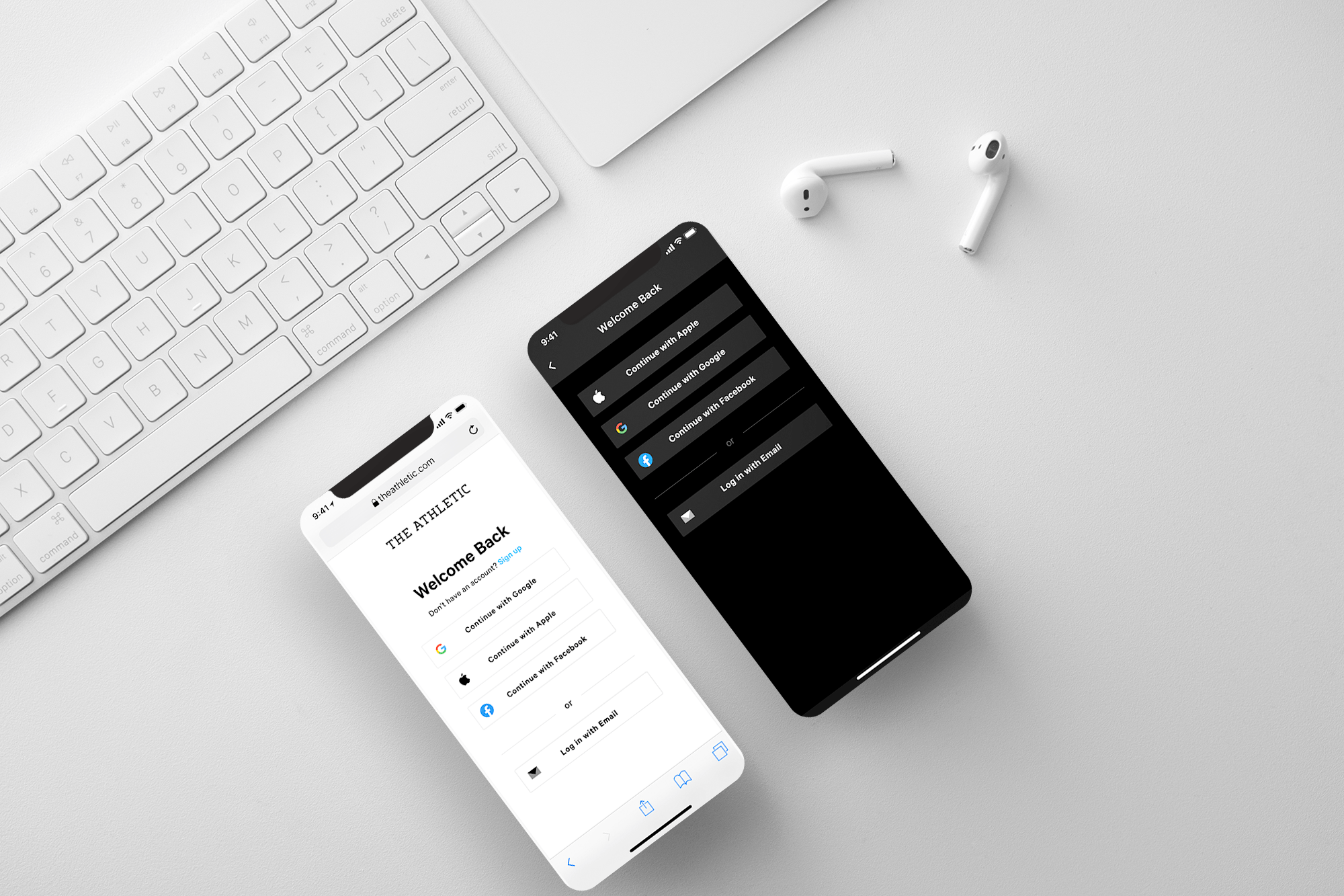
Users need additional methods for signing up and logging into their accounts. This add-on would decrease friction during account registration and login, expediting the entire process. Initially we began with Facebook and email login methods. For this project, we added Google and Apple login options as well.
rebrand
The company brand evolved beyond the original design. It was time for an update to the visual language and functionality of the login flows. UI updates were made to the overall look and feel of the pages in terms of fonts, spacing, buttons, colors, element/component sizing, interaction and overall theme.
copy
Updates to header, subheader, button, and link copy optimizing for simplicity and brevity of communication.
GDPR compliance update for the UK registration flow. We added a new component - an optional checkbox during the account registration flow to receive promotional email content.
Users & Audience
Because of the global nature of this project, our goal was to optimize the login/registration experience for both returning and new users. We redesigned both the login and registration flow accounting for various user profiles:
subscribed user
email account user
social login account user
anonymous user (no account)
user in checkout process (purchasing a subscription)
user redeeming a gift card
Team & Role
My role involved designing the iOS, Android, and responsive web experience. The team included a PM, Designer, iOS engineer, Android engineer, web engineer, and key stakeholders involved in the marketing and product vision. The project spanned about 4 months.
UI flow
We began by outlining our current login flows and determining what pages needed updating with the new design. The pages were Account Creation, Login, Forgot Password, Reset Password, Checkout registration/login forms, and the Redeem Giftcard flow. Account creation and login screens were designed for The Athletic iOS app, Android app, and responsive web. The remaining pages existed primarily on the web. One major change for these login methods involved going from a dark theme to a light theme for the web flow.
BEFORE
Account Creation, Login, Reset Password, Change Password, and Checkout registration web desktop screens.
AFTER
Account Creation, Login, Change Password, and Reset Password web desktop screens.
error states
We considered the form and error state messaging logic throughout the project lifecycle. We accounted for all necessary states of each new login method, which primarily impacted the email sign-in/signup flow. There were also existing interactions that we needed to restructure such as client-side error messages that appeared while the user was still typing.
A few of the new error states for the Account Creation, Login, and Reset Password screens.
social login options
One of the topics of debate was the styling approach of the social login buttons. Our goal was to be as clear as possible allowing the user to seamlessly continue their login flow. We considered different button styles, icons, and copy for these options. We thought using icons may save space in the layout, but may lead to more confusion for the user as to their functionality. We settled on an extended width button style for the social and email login buttons with the phrase “Continue with…” on each button denoting the following step in the user’s flow.
New social login buttons
For the main login and registration screens, we considered numerous design approaches for the main layout. One of the options involved a split-screen view, where we planned to feature a product screenshot of the app, or split the social login options from the email login. We decided against these strategies, concluding that adding an image or splitting the form would be too distracting to users during the login/registration process.
Split screen form design variations.
ui flows & interaction
For the purposes of this case study, I’ll focus on the web and iOS account creation and login flows. The project involved redesigning all login method options (Account Creation, Login, Password Reset, Change Password, Web Checkout, and Redeem GIftcard) for our existing platforms (iOS, Android and responsive web).
One of the major updates involved improving the interaction and design of the registration forms. When an input field is selected, the grey (default state) underline turns black (active state), as well as the text font. When deselected, the form field returns to its default state styling. This visually interactive change helps to speed up the registration/login process, ensuring a successful flow.
Redesigned Account creation web flow with error states.
The account creation process on the iOS app differs slightly from the web experience. For our app flow, each step of the registration process is split up into its own screen. For instance, we ask for the user’s email and password on one screen followed by asking for their first and last name. We disabled the upcoming ‘Next’ buttons until all forms are properly filled out. On the web flow, we similarly disable the CTA button until are form fields are filled out. The main difference is that the web flow asks for all information at once in its form design.
Redesigned iOS Account Creation flow with error states.
Below are the UI flows for the web and iOS Login experience.
Redesigned Login web flow with error states.
Redesigned iOS Login flow with error states.
outcome
This project was well received by the company and the project stakeholders. It was released in Fall 2020.